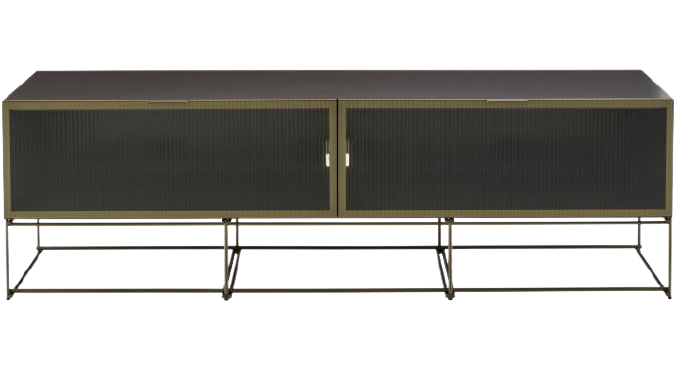
A provocative note somewhere between the essential industrial Bauhaus elements and contemporary elegance is struck through metallic finishes. The colours, reflected evanescently by the striped glazed panels, fade progressively to the point of disappearance, producing optical abstractions. An impression of segmented, repetitively rhythmed geometric figures, emphasised by the lacquered surfaces and wood panels to the rear, appears poetically, like a curtain which discreetly heralds the interior.
TECHNICAL DESCRIPTION: The CANALETTO collection of glazed units is a small but very singular range. The upper section is completely glazed, both front and sides, with a ridged glass with a widely-spaced linear pattern, an alternation of dips like peaks and troughs. This slim glass lets one see, or least guess at, the outlines of the objects held within, as the light plays across it. The glass of the doors is mounted flush with the smoked, brushed anodised aluminium frames, held in place by invisible glue beneath a bronze martingale. The lower shelves are in metal and are slim, lacquered and entirely rear-mounted, being attached to the back panels. The back panels are arranged between the shelves. They are either in dark walnut veneer, or lacquered. In such pieces as these, lighting considerably enriches their appearance and shows to best effect the outlines of objects behind the doors and sides.
This lighting takes two forms : In the display unit there are 4 horizontal illuminated strips set into the 4 back panels, with a smoked diffuser which does not allow glare and which is attractive even when unlit. The version with remote control and dimmer enables the light intensity to be reduced if desired.
In the sideboard and high 2-door chest, indirect lighting comes from the rear of the vertical side panels, with an illuminated strip located on the rear edges of the panels ; it illuminates both sides and creates a beautiful halo of light inside the unit. The colour of the shelves and back panels adds to the lighting ambiance and can also be modulated via the dimmer.
The base is in steel, with 12mm roundels mounted like an array of bamboo for solidity and lightness; it contrasts with the top. It is finished in bronze lacquer to co-ordinate with the aluminium door frames. The legs have height-adjustable jacks for levelling purposes. Its height is 250 or 500 mm, depending on the unit.

Canaletto Display Cabinet
THE CONCEPT: This ensemble of display units could resemble a geometric spatial occupation challenge between the body of the chest which is at once solid and diaphanous, and the thin mesh which streamlines the perimeter of its flat surfaces and is seen as an extension of the carcase.
Mauro Lipparini’s intensive activities in the field of industrial design encompass furniture for both home and office, textiles and other products created for numerous companies in Europe and Japan. In terms of architecture and interior design, he focuses mainly on residential and commercial buildings such as corporate headquarters, showrooms, shops, restaurants and exhibition spaces. In addition, he designs and produces advanced image and corporate identity systems ranging from graphics to editorial services and production.
The style of Lipparini, based on pared-down forms and clear, vigorous lines, the characteristics of natural minimalism, is heavily influenced by gaiety of spirit, and an intoxicating sense of aesthetic pleasure and creativity. Through the free use of colours, organic frameworks and original visual ideas, Lipparini broadens the palette of minimalism by converging instantaneousness and the power of this aesthetic quality in new era of maturity and a sense of wellbeing.
For Mauro Lipparini, design is the inevitable tension between aesthetics and function, art and application. He enables a product to become both agreeable and intriguing, a functional or superfluous object to be transformed into one charged with aesthetic sense and semantics, thus enriching the domestic landscape. He enables a space or its ergonomy to come alive with an ever-new relevance. Design engenders desires which will improve the quality of life, it enables us to view progress with increased involvement, it renders the understanding of function and therefore the perception of one’s habitat both passionate and agreeable.
Design is not the application of form like make-up, it is the object in itself, it is the tradition, the culture which enables people to have more or less indirect contact with the intellectually avant-garde by democratising art. It can be more or less poetic, constructive and considered, but it must always push the very limits of risk by forgetting habits and customs.
These considerations form the base of my work and, through simple, vigorous lines, graphic abstractions, compositions and purely geometric decompositions, I am ever on the trail of beauty and pleasure with a view to allying form and function. A natural minimalism of pared-down forms, paying particular attention to materials, colours, surfaces, to thick and thin, light and shade.


